


Color is one of the most important factors in event display design, influencing 62-90% of first impressions. It’s not just about aesthetics – color impacts emotions, brand recognition, and audience engagement. Here’s how businesses can use color effectively:
- Consistency Matters: Stick to your brand’s colors across all materials for a unified look.
- Psychology of Color: Choose colors that evoke the right emotions (e.g., blue for trust, red for energy).
- Practical Tips: Test colors under different lighting, use high-contrast combinations for readability, and select weather-resistant materials for outdoor displays.
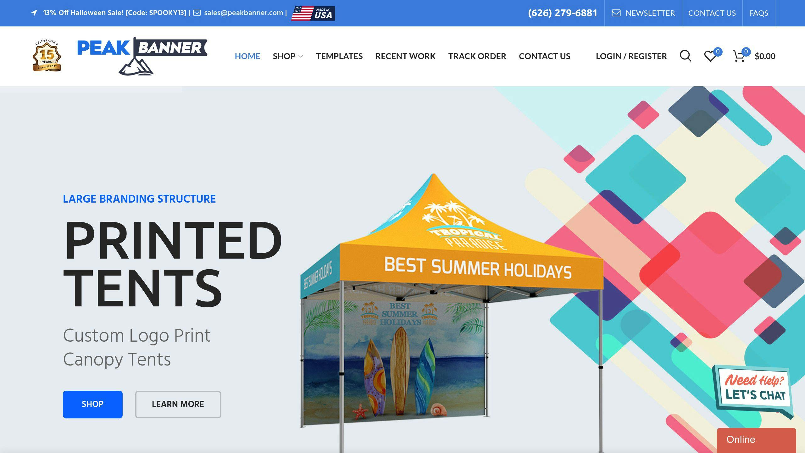
- Effective Products: Tools like Peak Banner’s vibrant, full-color prints ensure consistent branding on items like canopy tents, feather flags, and table covers.
Quick Comparison: Peak Banner vs. General Strategies
| Aspect | Peak Banner | General Strategies |
|---|---|---|
| Color Vibrancy | Bright, consistent prints | May require manual adjustments |
| Ease of Use | Quick setup, pre-tested combinations | Requires more planning and testing |
| Cost | Bundled options for lower costs | Higher costs with multiple providers |
| Customization | Limited to specific products | Flexible but requires more effort |
Using the right color strategy can make your event displays stand out, connect with your audience, and leave a lasting impression. Let’s dive deeper into how to make the most of color.
1. Peak Banner’s Approach to Color
Customizing Colors for Brand Consistency
Peak Banner ensures consistent color reproduction across various display items like canopy tents, feather flags, and table covers. This attention to detail helps brands maintain a unified look. Their technology accurately replicates gradients, patterns, and Pantone colors, making it easy for brands with strict design guidelines to stay on point.
Designing for Maximum Visual Impact
Peak Banner focuses on creating vibrant displays that grab attention, even in crowded event spaces. Their prints retain their brightness in any lighting, ensuring your brand looks consistent no matter the environment.
Their user-friendly setup system not only keeps colors consistent but also saves time and effort, making it ideal for businesses managing multiple event locations. This balance of design and efficiency allows brands to make a strong impression without added hassle.
| Display Type | Color Application | Key Benefit |
|---|---|---|
| Canopy Tents | Full surface coverage | High visibility |
| Feather Flags | Double-sided printing | 360° brand exposure |
| Table Covers | Edge-to-edge printing | Seamless branding |
| Pop-up Banners | High-resolution color | Crisp, sharp visuals |
By combining bold printing techniques with easy-to-use setup systems, Peak Banner helps businesses deliver striking visual displays without sacrificing efficiency. Their method shows how color can elevate marketing materials, reshaping the way brands showcase themselves at events.
Although Peak Banner’s approach is a standout example, the broader industry also offers valuable insights into using color effectively for brand success.
2. General Practices for Using Color in Displays
Peak Banner is a great example of how brands can use color effectively, but there are broader principles that any business can follow to make their event displays stand out.
Color Customization Options
When choosing colors, keep these strategies in mind:
| Color Purpose | Application | Effect |
|---|---|---|
| Accent Colors | Highlights and CTAs | Draws attention |
| Background Colors | Large surface areas | Sets the mood |
| Text Colors | Information hierarchy | Improves readability |
Making an Impression and Strengthening Your Brand
Using color to make an impression involves balancing psychological factors with practical considerations. UX/UI Designer Akis Apostoliadis explains it well:
"Context in color matters. How you combine color affects people’s perceptions of your brand"
Key factors to consider for effective color use in displays include:
- Environmental Context: Match colors to the venue’s lighting and nearby displays to ensure your booth stands out.
- Cultural Associations: Be mindful of how different colors are interpreted across various cultures.
- Brand Consistency: Stick to your brand’s color guidelines to maintain a cohesive identity.
- Emotional Impact: Choose colors that evoke the reactions you want from attendees.
Practical Tips for Implementation
Bringing your color strategy to life requires thoughtful planning. A great example comes from Legalweek, where designers used pink and blue in different variations across all branding materials, creating a cohesive look that appealed to a wide audience.
To make implementation easier:
- Stick to a limited color palette for a unified design.
- Test your colors under different lighting conditions to ensure consistency.
- Use complementary colors to visually separate different event areas.
The General Counsel event showcases how this approach works in practice, using color to clearly distinguish segments while keeping the overall design tied together.
sbb-itb-c623e60
Strengths and Weaknesses
Analyzing Peak Banner’s offerings alongside broader color strategies gives event planners a clearer picture of what works best for their unique requirements. Here’s a breakdown of how these two approaches compare:
| Aspect | Peak Banner Solutions | General Color Strategies |
|---|---|---|
| Color Vibrancy | Bright, eye-catching prints for visibility | Requires careful coordination to maintain uniform vibrancy |
| Versatility | Reliable for both indoor and outdoor use | Can be limited by specific venue conditions |
| Implementation | Quick setup with pre-tested color combinations | Demands more time and planning |
| Cost Efficiency | Bundled options reduce branding costs | Costs increase when using multiple providers |
| Customization | Restricted to certain product options | Offers more freedom in design elements |
Color plays a major role in audience engagement. Studies show it influences 62-90% of initial impressions, highlighting its importance in shaping perceptions. As Murray points out, color has a direct impact on consumer behavior. Peak Banner focuses on maintaining consistent vibrancy, while general strategies adjust more flexibly to the venue’s specific requirements.
Event planners often combine Peak Banner’s products for branded materials with general strategies for venue-specific designs. This blend allows them to harness the advantages of both methods while addressing their individual limitations.
Striking the right balance between these approaches is crucial for creating impactful event displays. This topic will be explored further in the next section.
Summary and Recommendations
Analyzing how color impacts event display design reveals clear strategies for success. Thoughtful planning and execution are key to making the most of color in event displays.
Here are some tailored strategies based on specific event goals:
| Event Goal | Implementation Strategy |
|---|---|
| Brand Recognition | Stick to consistent brand colors across all display elements. |
| Cultural Engagement | Select colors that resonate with the audience’s cultural preferences. |
| Emotional Impact | Use warm colors for energetic events and cool tones for professional settings. |
| Visual Navigation | Distinguish areas with unique color schemes, like Legalweek’s pink and blue system |
The General Counsel event is a great example of using complementary and analogous colors to differentiate multiple conferences while keeping a cohesive look.
Practical Implementation Tips
For any event, keep these tips in mind:
- Stick to consistent color choices across all materials.
- Test colors in different lighting conditions to ensure they work well.
- Choose weather-resistant materials for outdoor displays.
- Use high-contrast colors to improve visibility.
- Add vibrant accents sparingly to avoid overwhelming attendees.
Combining durable materials with smart color choices makes displays more effective. Companies like Peak Banner, known for their bold full-color prints, provide a solid starting point. Matching these prints with colors that align with your event’s goals will ensure your displays leave a lasting impression.
FAQs
What is the best color for a vendor booth?
Studies show that blue is often a strong choice for vendor booths because it conveys trust and reliability. Pairing it with complementary colors like white, gray, or green can create appealing combinations tailored to different industries and goals.
| Color Combination | Purpose | Ideal For |
|---|---|---|
| Blue + White | Clean and professional | Corporate services, technology |
| Blue + Gray | Polished and sophisticated | Financial services, consulting |
| Blue + Green | Eco-focused and growth-oriented | Sustainability, healthcare |
When choosing booth colors, keep these factors in mind:
- Industry Relevance: While blue works well across many sectors, some industries may benefit from different palettes.
- Event Lighting: Test your colors under the venue’s lighting to ensure they look as intended.
- Cultural Perceptions: Be aware of how colors are interpreted across different cultures.
Although blue is a popular and effective option, the best choice depends on your brand and audience. Combine thoughtful color selection with quality materials and good lighting to make your booth stand out.


